Thursday, 29 April 2010

Evaluation: Question Four

How did you use new technologies in the construction and research; planning and evaluation stages?

Internet Sites:
Blogger:
Blogger was used to present all of my coursework, I found this way easier than having multiple sheets of paper and disks, which are easily lost and damaged.

Blog Dashboard :
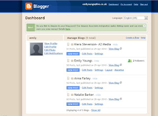

My Blog:

Facebook:
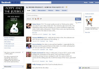
I used Facebook to create a group to gather feedback from the products that we created, this was a good way to gather data as it was easy to create and the members were asked to join automatically. Then they could comment on the products straight away.
Feed back page:
YouTube:
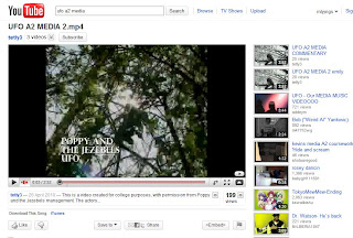
YouTube was used to upload our video on to out blogs and on to facebook, having it on YouTube meant that it was easy to access, rather than carrying round a laptop showing people our video at full quality from a disk. However there where some draw backs due to having to compress the file which left it pix-elated. It was also used to upload the commentaries for answer for question one.
Music Video on YouTube:
Google:
I used google to research into magazines, artists and information needed for planning.
Equipment:
JVC 300 camcorder:
This is the camera that we use. We had to use this camera instead of the Sony HVR A1 as there where no sony camera available that day. Considering we used the JVC camera the quality is still fairly good.

Zoom Recorder:
Natalie and I used a zoom recorder to record ourself talking over the music videos for the commentaries. We decided to do it this way rather than having lots of text describing what we did and why we did it.
zoom recorder:

Sanyo Xacti VPC-CG10BK Camcorder:
I used this camcorder to film a member of our target audiences response to the poster, digi pak and music video.
Camcorder:
Software
Photoshop CS3:
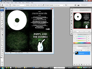
Photoshop was used to create and edit the Poster and Digi Pak. We used Photoshop as it is the most advanced editing suite that we could find. We edited the image in photoshop by altering the levels, brightness and contrast and then using the burn tool to darken the outside edges, this created the dark shadows. I was also used to layer on items in the Digi Pak, and adjusting the image size to the right measurements of a Digi Pak.
Screen shots of Photoshop:

Imovie:
Imovie was used to edit the music video:
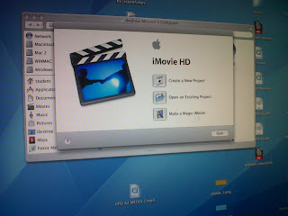
a number of effects where used such as: aged film and black and white.
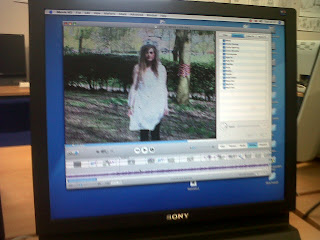
the brightness and contrast was used to adjust the balance of lighting.
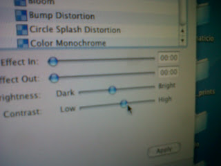
It was also used to add in the transitions from shot to shot, so they flowed evenly.

ITunes:
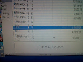
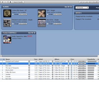
I used ITunes to Download the song "UFO" by Poppy and The Jezebels, and to also upload the voice over for the commentaries.
Quicktime:
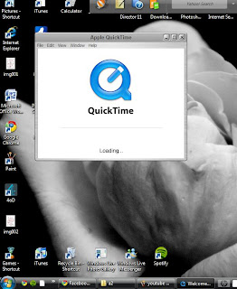
We used quicjtime to compress the music video, we did this so we could transfer the video onto a memory pen, and also upload it to YouTube.
These are all the; internet sites, equipment and software that i used throughout this project, if i didn't have these components i wouldn't have been able to create my blog and products to the standard that i have.

Evaluation: Question Three

What have you learnt from your audience feedback?

This is a link to a Facebook page which we created so we could show our product to peers to recieve feedback.
http://www.facebook.com/photo.php?pid=11929060&op=1&o=global&view=global&subj=625848804&id=727995113#!/group.php?gid=114180581949420

This is a screen shot of the feedback page:


This is a screen shot from the feedback for our Digi Pak:


This is a screen shot from the feedback of out Poster:


I also filmed a member of our target audience giving feedback on all three of the products:

filmed on a Sanyo Xacti VPC-CG10BK Camcorder

I also created a questionnaire and handed it out to 10 people who watched the video;
this is one example of the questionnaire:

These is a screen shot of the spread sheet that i created:

this is an example of some of the graphs created to show the data gathered:
Using different methods to attain my feedback is useful as i can have views from videos; which are more personal, and written feedback which is more formal. Also using the internet to gather feedback is easier than having lots of questionnaires to hand out, or having to carry round a laptop to show the video to the target audience.
Conduting audience feedback gives you constructive criticism about your work, as you are recieving directing feedback from the people who you want to advertise the products too.
If i was to redo this project again i would probably make the idea of our video more promient, i would add in more surreal and dark characters and components to make the music video "scarier". I would also use a character which relates back to the title of the song more. This was mentioned frequently throughout the feedback, people where unsure on our reasons to use the rabbit mask. However looking at the evaluations altogether you can see that the feedback is contantly above average, this means that the majority of our feedback is positive, which means our overall products are a success.

Evaluation: Question Two

How effective is the combination of your main product and ancillary texts?


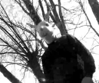
The rabbit mask is used throughout all of the products, we decided to have this as our main image instead of the main actor Jo as it relates to our surreal theme. This is the exact mask that was photographed for the Digi Pak and Poster

This screen shot symbolises the continuity between the advertisement, digi pak and music video due to the foliage. We decided to film our music video in a area which was surrounded by trees, because of this we wanted to carry on that theme through the Digi Pak and Poster, this is why the backgrounds for the ancillary products have grass as the background.


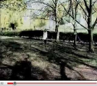
This screen shot relates to the “darkness” of our Digi Pak and Poster; we wanted this theme to be recurring throughout all of our products. The idea was for our products to loo surreal and “scary”.
The darkness was enhanced throughout editing, as well as decreasing the saturation to reduce the colour.

Having this continuity between all three products is vital. If there isn’t any relation between the products then it would be difficult for the public to match up the song with the Digi pak. For example; If they saw the advert in a magazine, and then viewed the video on the television, an there wasn’t a clear link between the products, how would the audience know that the two products where linked together. There needs to be a clear link between the two so that buyers aren’t lost through cross media advertising.


This is a link to my blog explaining what my personal view of Cross Media Advertising is:http://emilymediawork.blogspot.com/2010/02/cross-media-advertising.html


What are the purposes for each product?
The reason for the Advertising Poster is advertising. It's one of the easiest ways to attract fans, a number of people buy music magazines, so the advert would be featured in many magazines, such as; Q, kerrang, NME and Rocksound. The advert gives the reader more websites to find more information about the reader, it shows then when the song is out and what the name is. Without this advert it would be hard for an member of the public to find the digi pak.

The reason for the Digi Pak is advertise the product, however the advertising is subtler than the poster; the front cover has to be attract and it has to appeal to the buyers. the main purpose for the product is to hold the CD.

The purpose for a music video is to advertise the band and song through a different medium - using the television to advertise means that the video will be viewed by a larger portion of the public, not everyone buys music magazines, but more people listen to music channels, even if it is just for background noise, they would still hear the song.


Overall i feel that the combination between the ancillary products and my main product was a success. There are links throughout the video to relate back to the colours, props, ideas and structure of the Poster and Digi Pak. I am pleased with the overall out come of the products that we made. However i think we could have improves vastly on the quality and idea of the video. A lot of information and ideas where lost through complications and communication. And i feel that i different idea, perhaps filming a band live, would have been more effective, and could have been targeted at a larger section of the public.

Evaluation: Question One


In what ways does your media product use, develop or challenge forms and conventions of real media products?

Video:

Poster:


Digi Pak:

Throughout this project i have learnt new skills which have help me to create the final products; the main skills that i acquired was the filming and editing, as i had never done either before. We used a JVC 300 cam corder to film to product, and Imovie to edit the film.
What i most enjoyed about this project was editing the video, as i did the majority of the editing, with help from another member of my group Natalie. We used a number of different effects and cutting, and as i already had previous experience with Photography and Photoshop, it was interesting to see another side to the film and photography medium.
If i was to re do this project project again the main thing that i would try and improve on is the communication between our group, this is one of the problems which effected our overall products. If there was better communication between the members then i feel that the projects would have been to a higher standard, as more ideas would have been incorporated into the products. The quality of the film is also debatable - i feel that if we had spent longer filming, we would have a wider variety of shots, and this would have added a diversity to the film.

Analysis of Ancillary

Digi Pak:

Poster:

The two images demonstrate how photoshop was used to create the products, it

Analysis of Video

We filmed out music video at the Rec in Stratford, originally we were going to film our music video at the bluebell woods however we changed locations so it was close enough for easy travelling for our actors and the equipment.
Mise en scene:
The setting was decorated with colourful fabric and materials. We did this to add texture and colour to the standard forest like background. We had the actors dress in unusual and surreal costumes to relate back to the theme of the video; bright colours and patterns for the costume and using masks and face paint.
Editing:
i used a beat of 4 and 8 to create a sense of rhythm throughout the music video, i did this so that it matched up against the song. Otherwise the cutting rate and beat of the music would have been irregular, it's plays better when the beats are paired together. I also adjusted the brightness and contrast to balance out the brightness and contrast the video, but i also changed the contrast to darken certain parts of the background. I then adjusted the saturation as changing the contrast made the colours more vivid, another reason for de-saturating the video was to relate back to our theme of the video being slightly "dark and surreal". I added in certain effects such as "aged film" and "black and white" to add diversity to the video, fade in and outs where used in certain places as transitions between different shots. In some places transitions weren't used, this was to show the beat of the film against the music. It also made the film more "jumpy".
Lighting:
We didn't have any extra lighting stands or equipment, the lighting that we used was completely natural whilst filming. It was changed in the editing process.
Camera work:
A mixtures of shots where used throughout the video. The main shots that were used were mid and long shot; these shots were used to show the scenery and costume. Establishing shots are used throughout the video to show the location and decoration. Panning and tracking shots are used to follow the main actor Jo, as she "explores" the surroundings, a mixture of close ups and mid shots are used to introduce new characters. A number of different camera angles are used to demonstrate different view points from the characters
Sound:
The only sound used in the video was non diegetic sound; this was from the song that was added over the video.

High Angle shot:

Low Angle shot:

Example of Mise en Scene:

Example of Editing (aged film):

Final Products

Music Video
The poor quality of the video is due to having to compress the video to upload it to Youtube.


Digi Pak

Poster
These are the final product for our the Advertisement Poster.
As a group we decided on the look of our product, what would be on the cover, the text, the picture, the colours and so on. Natalie took the final image and then edited the final product.

Tuesday, 20 April 2010

Edit Techniques


Aged Film
Black and white
Brightness
Contrast
Saturation
Fade in (transitions)
Fade out (transitions)


Aged film was used due to our research; we wanted to use the idea that Miike Snows video “animal” used. It created a vintage style feel to the video. We also did something similar too when Miike Snow moves gradually towards the camera, he moves forward with jump cuts.

We used a black and white filter at some parts to differentiate between the view of the audience and the view of the main actor, it also gave us the chance to use more features in the video clip.
The brightness and contrast was adjusted so that we could achieve the right darkness to the video, without losing detail in the image. This related back to our original idea of the music video being surreal and dark. The saturation was the adjusted so reduce the vividness of the colours which were enhanced when changing the contrast.
The Fade in and out transitions where used to make the video flows nicely between certain shots, transitions where only used occasionally because we wanted the music video to have a jumpy rhythm in beats of 4 and 8.

Monday, 19 April 2010

Actors in Costume

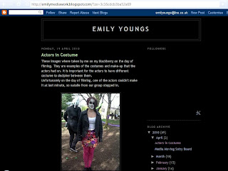
These images where taken by me on my blackberry on the day of filming. They are examples of the costumes and make-up that the actors had on. It is important for the actors to have different costume to decipher between them.
Unfortunately on the day of filming, one of the actors couldn't make it at last minute, so natalie from our group stepped in.


Sarah

Jordan (Rabbit)
Nat (step in)
Jo - main character

Emma

Sunday, 18 April 2010

Risk assessment


Front of risk assessment sheet:


Back of risk assessment sheet:

Tuesday, 13 April 2010

Media Moving Sotry Board


This media story board was created by a member of my group. I was unabale to create my own as i do not have the correct software to on my home PC.
Having a moving sotry board is an ideal way to see how long certain shots will be. You are able to see if the frame shot is too long or to short.

Sunday, 28 March 2010

Digi pak final layout


This is the final layout for the Digi Pak, we will be following the regulated measurements to make sure that our Digi Pak fits together correctly.

Thursday, 25 March 2010

More possible layouts for finals

After creating the previous three posters, we realised that we would not be able to access another picture of our model in time to create a new poster. Therefore i have created four more posters using the rabbit mask as the main focus. The rabbit mask has been featured in the music video. The images where taken originally by Natalie Barker (member of my group), but i have edited them myself.


I edited this image by changing the colour balance to give the picture the pinky tinge, I then used the "wave" shape to creates the curved title. I decided to have the title like this to add a bit more diversity to the image, and it make it look more appealing. I chose to have the smaller writing in a pink to match the background colours. This wasn't a very good idea as the writing doesn't stand out that well against the dark pink/purple background. I also used the "burn" tool on Photoshop to create depth around the edge of the image.


To create the mosaic effect on this image I used a Photoshop filter called "mosaic tile". I then used the font shaper to make the curved writing for "UFO" i chose to have this front purple so it would stand out against the green background, i like the contrast between the two colours, it works well and it doesn't look too garish. I like the layout of this poster, i think having the rabbit mask central works well. Your eye is lead straight down the page.


What i like about this poster is the "vintage" look that the sepia tone has given the image, as well as the filter that i used to create the unusual effect. I used a filter on Photoshop called "Stained Glass". I decided to have the "UFO" title in green, this wasn't the best idea as it doesn't stand out very well against the brown background ( a similar problem from a previous poster). However i like the balance between the two sides of the poster, having the image on one side and the text on the other.


In this image i used the "Cut out" filter on Photoshop, i have used this filter in previous drafts and it worked well. What i like about this image is the cartoon like effect the filter has created on to the image. From all the editing it looks nothing like a photograph, and i feel that it makes it look more professional. I used the Stencil font for this poster, it works well in this image, as it matches up with the bold white rabbit at the bottom, however i feel that i softer, less harsh font would be suitable for out final product.

Overall my favourite layouts are number two and four. I think that these two would work best as a final advert and would fit well in any music magazine.